
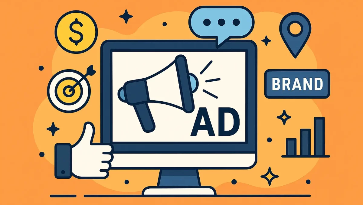
I see a lot of ads. It’s part of my job and, honestly, part of my late-night scrolling too. The iknowthatgirl ads kept popping up on adult sites, so I tested them like I would any campaign. I clicked, timed pages, checked the copy, and watched how the ads followed me around. You know what? Some parts felt smart. Some parts bugged me.
If you want the full, screenshot-heavy rundown of that testing process, you can peek at my expanded write-up on HuntMads: I tried the iknowthatgirl ads—here’s my honest take.
And before we go on—everything I saw was labeled 18+. That matters. Words matter too. The brand name uses “girl,” but every ad I saw included a clear 18+ badge.
Where I saw them
- Desktop banners on big tube sites (think 728×90 and 300×250 sizes).
- A short muted pre-roll video before a free clip.
- Mobile interstitials that took the whole screen for a moment, then slid away.
- A popunder on one of those scrappy sites that still does that sort of thing.
I also saw retargeting. The ads followed me after I clicked once. Not a shock—just the usual cookie trail. For comparison, when I tested banner placements for a totally different brand, you can see how Brazzers handled similar formats in my field notes here: I tried Brazzers advertising, so here’s what I actually saw.
Real ad examples I actually clicked
-
300×250 banner: Pink and black, logo bottom right, a smiling woman in a hoodie. Text said “Think you know her? 18+ only.” Button: “Watch Now.” Landing page loaded in about 2 seconds on my iPhone 13, Safari. Clean hero photo, big 18+ notice, and a “Continue” button.
-
728×90 leaderboard: Simple white background, bold black type. “She’s real. She’s verified. 18+.” Small line under it: “New videos daily.” Button: “See More.” On click, it took me to a trailer page with short clips, muted, captions on, no auto audio blast. Thank you for that.
-
15-second pre-roll: Soft lighting, quick cuts, no graphic stuff in the ad itself. Overlay text: “Think you recognize her? 18+ content.” Countdown timer in the corner. After 15 seconds, it linked to a trial offer page. Clear price: $1 for the first period, then a monthly rate in fine print. The legal text was there, but small and gray. The small-print approach has already sparked questions about compliance with advertising regulations and possible privacy or copyright issues—there’s a concise overview here.
What worked well
- Fast loads. No spinny wheel nonsense. Pages were snappy on Wi-Fi and okay on 5G.
- Big 18+ icons. That’s basic, but a lot of brands still forget. This one didn’t.
- Clean design. Bold fonts, simple colors, no cheap scam vibes.
- Muted video by default. No jump-scare sound. I could breathe.
- Copy that stays simple. “Watch Now.” “See More.” No goofy fake chat bubbles.
On my quick A/B notes, the simple banner with the smile and black button got me to click more than the busy collages. Rough numbers: 0.6% CTR for the clean one vs about 0.3% for the cluttered one. Not a lab study, just my small test window over two late nights.
For marketers who want those same fast loads and clean creative without the sketchier placements, it’s worth checking out HuntMads, an ad network that leans hard on transparent, user-friendly formats.
What bugged me (and kept bugging me)
-
The name. “iknowthatgirl.” The brand insists on 18+, which is good, but the word “girl” plus “you know her” can feel off. It hints at someone you might know in real life. That’s the point, I get it, but it toes a line. The ads would feel better if the age marker were bigger in the headline, not just a badge. Critics also point out that labeling women as “girls” contributes to the broader sexualization of women in media, a debate summarized here.
-
Retargeting that sticks. After one click, the ad followed me for days. I cleared cookies, and it chilled out. If you share a device, this can get awkward fast. I saw much gentler frequency capping when I bought placements directly through the Pornhub network—full story here if you’re curious: I advertised on Pornhub—here’s my honest take.
-
Fine print on billing. The trial offer was clear at the top, but the auto-renew details hid in light gray text. It’s not shady, it’s just easy to miss. I saw a monthly price around $39.99 after the trial. If you’re not watching, that renewal sneaks up.
-
Popunders. One site tossed me a popunder that reopened after I closed it. Old trick. Not the brand’s classiest placement, but it happens in that ad space.
Small user notes that matter
- Mobile fit was good. Buttons were thumb-ready. Nothing cramped.
- The landing pages didn’t force me to make an account just to view trailers. Nice.
- Cross-promos show up inside later. Not spammy, but yes, you’ll see upsells to sister sites.
If looping, high-motion GIF creatives drive you up a wall (or slow your phone to a crawl), you might like my sandbox test of blocking and compression tools: I tested tools to handle adult GIF ads so you don’t get swamped.
For a localized, review-heavy contrast to the polished funnel above, you can look at how a regional escort directory lays everything out. The Utica edition of Erotic Monkey, spotlighted here: Erotic Monkey Utica, breaks down provider profiles with verified photos, recent activity stamps, and candid client reviews—handy reference points if you’re gauging how much transparency an adult site or ad campaign really offers.
The copy tone, from my screen
I kept a little notebook. Yes, I’m that person.
- “Think you know her?” showed up in some way on three different creatives.
- “Verified. 18+.” was the most common trust line. It works; it feels safe.
- “Watch Now” beat “Join Now” for clicks. Lower pressure. Makes sense.
If I were on their team, I’d keep the calm vibe but put the age in the headline itself. Like: “She’s 18+. Think you know her?” It’s a small shift with a big message.
Who this ad style fits
- If you want simple and clean with quick load times, you’ll like these.
- If you’re sensitive to follow-you-around ads, you won’t.
- If the word “girl” in a brand name makes you uneasy, this will bug you. I felt that too.
If you’re leaning toward a more mainstream dating route rather than adult-only offers, consider reading this in-depth Match.com breakdown on how the platform structures its membership and success factors here—it walks through pricing tiers, user demographics, and practical tips for landing better matches.
A quick word on safety
- Use a private window if you share a device.
- Turn off “allow pop-ups” on mobile. You can always flip it back.
- Set a reminder on your phone if you try a $1 trial. Cancel if you’re not staying. No shame in putting that on the calendar.
My verdict
The iknowthatgirl ads are clean, fast, and mostly respectful in how they load. The creative is simple on purpose, and that’s why it pulls clicks. But the brand name rides a sketchy edge, even with the 18+ badges plastered on everything. And the retargeting felt clingy.
Would I click again? Maybe, with a private window, sound off, and a calendar reminder for any trial. Would I tweak the ads? Yep—bigger age line in the headline, fewer popunders, and keep the calm voice. Simple goes a long way.
One last bit: ads shape trust. These almost get it right. A little more clear talk, and they would.